We turn your products and services into experiences that inspire, entertain and entice.
Brands we've worked on

Consolidate must-have services. Plan for growth.
Today's connected world demands a coordinated, well-orchestrated growth plan. Are your CRM, infrastructure, websites, marketing activities, and sales efforts working together or in silos? Our growth plans bring your essential marketing-technology pieces together to give your business a multiplier makeover. Get ROI. Get ahead. Let's make this easy for you.
What Our Clients Say
-
When we decided to take a look at rebranding our website, we reached out to our current partner for advice. What we found out was our partner was selling their business and Consumer51 was acquiring it. So we decided to interview several firms about branding and relaunching our site. After several meetings, it was clear that Consumer51 was light years ahead of the others we talked to. They understood our business, our philosophy and the direction we wanted to go. They even came out to do a site visit to understand how we make our products, understand our culture, and even took time to talk to the owners about their family business.

Bob Hartman
Director of Sales & Marketing
Knox Fertilizer Company, Indiana -
I have been working with Toby for almost 10 years, and his service, knowledge, and professionalism has ALWAYS been top-notch! Toby and the entire team understand the value of outstanding customer service. And this is why I have continued to work with them even when I’ve rebranded, built new sites, and moved 1,000 miles away. As one small business owner to another, when you find service this good, you stick with them! Kudos to this team.
Linda Simone D'Angelo
The Small Biz Shop, Indiana -
Many thanks to you and your staff for your web design and support services. Not only did we receive a complete new look, but we are receiving ongoing important services from you. We are well pleased with our new website, webmail, logo, stationary, business cards and signs. You listened to our ideas, gave us your ideas and worked with us throughout the entire creative process to achieve a unique package that serves our marketing needs. We can depend on you to be there when we need help. We highly recommend your company to others. It is a pleasure to work with such talented professionals.
Linda C. Majors
President, TCM8, New Mexico
Featured Work
NM Higher Education Department
UX/UI DesignWebsite Development
Los Poblanos Historic Inn
UX/UI DesignWebsite Development
Farmington Tourism
Digital Marketing & SEO
Knox Fertilizer Company
UX/UI DesignWebsite Development
Your implementation partner for:


We speak the universal language all consumers understand: empathy.
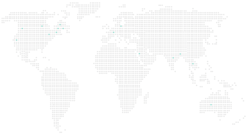
For more than six years, our philosophy of putting consumers first has won hearts around the world. Our footprint spans five continents, dozens of industries, and hundreds of millions of consumers. We would not have done it without such a talented team, but perhaps the real secret to our growth is a commitment to put ourselves in the consumer’s shoes, whether they are Indian, Australian, Swedish, or American.
Global Marketing & Design
Our Blog
- Diversity in Marketing: Beyond Opticsby sapan@csumer51.com (Csumer51) March 7, 2024
When it comes to diversity in marketing, brands are finally catching on to the fact that showcasing different perspectives […]
- ROI Matters: Measuring Success in Digital Marketing Campaignsby sapan@csumer51.com (Csumer51) January 24, 2024
Data is a treasure trove that gives you actionable insight to your campaigns and audience, but not all analytics are created […]
- How to Revitalize Your Email Strategy: Giving Value, Building Relationshipsby sapan@csumer51.com (Csumer51) December 21, 2023
In the digital age, where our inboxes are inundated with a constant stream of messages, it's easy to forget that email was […]
Have a project in mind?
Let's chat.